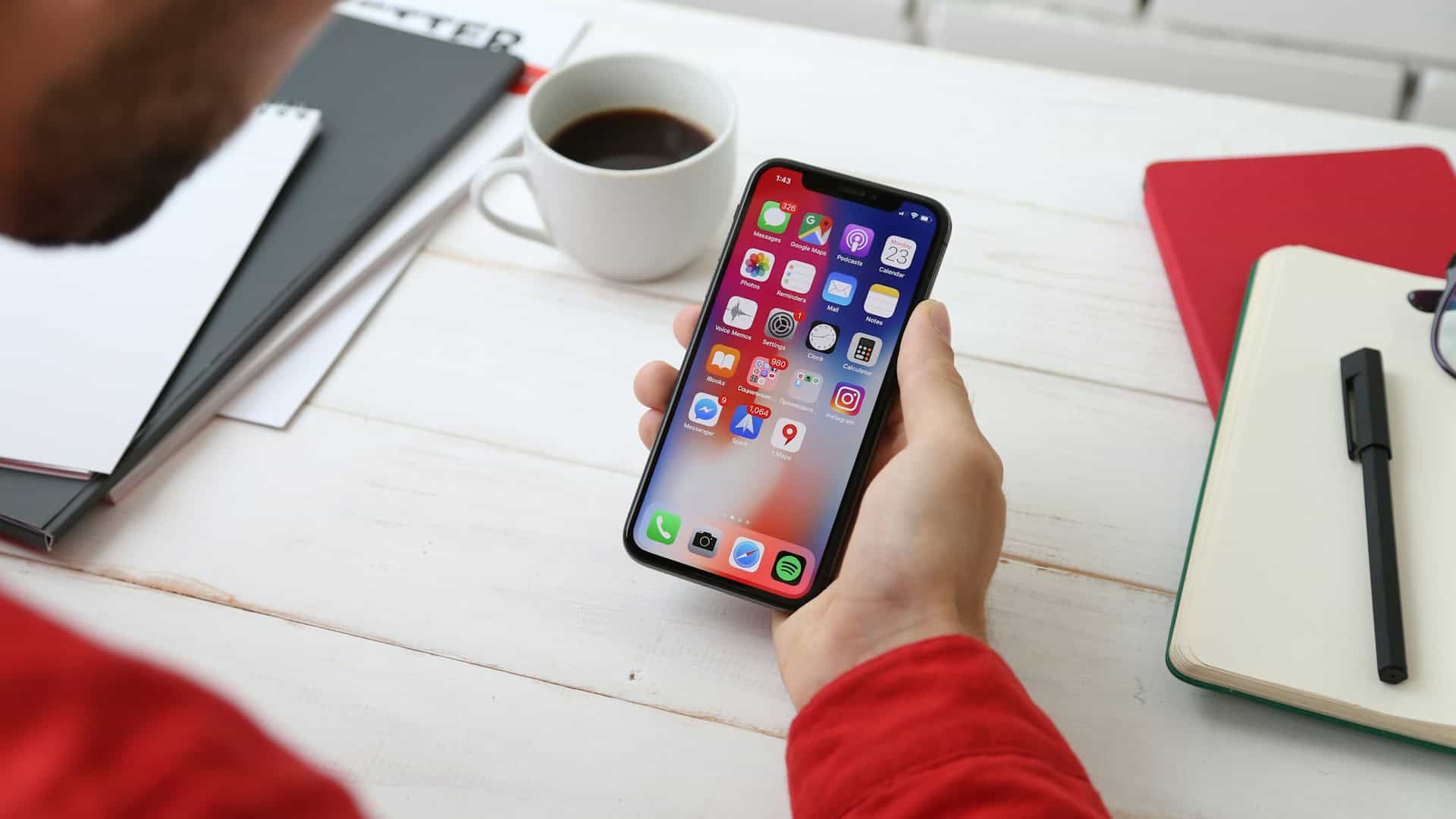
It’s pretty clear when walking around, just how common mobile devices are in everyday life. Attend a function, and just about everyone’s got a smart phone on them!
So what does that mean when it comes to YOUR website?
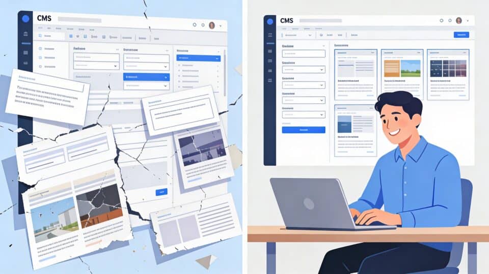
Put very simply – make sure you have a look at your own website, when using a smartphone or tablet, just to see how it looks. If the layout breaks, or important content on your site isn’t visible, it’s time to have a chat to a professional so that you don’t miss out on those customers who ARE using those devices to browse your website.
There’s a commonly used term – it’s called ‘Couch Commerce’. It refers to those people (myself included!) who sit back on the couch after a long day, and browse different websites on content on a tablet such as an Apple iPad or Samsung Galaxy Tab, or their mobile phone.
If your website doesn’t adapt to the screen size and display nicely for these users, you’ll lose their interest – it’s as simple as that!